Step 2 Data Exploration and Visualization
Source:vignettes/F2_Step2_Tutorial.Rmd
F2_Step2_Tutorial.RmdStep 2 is designed to visualize the processed data through a plethora of plots. All visualizations are interactive; samples can be removed, axes can be re-scaled, and graphs can be zoomed in. Step 2 includes the following sections:
- Section 1: Statistics Plots
- Section 2: Heatmap Panels
- Section 3: Selective Peptide(s) Visualizations
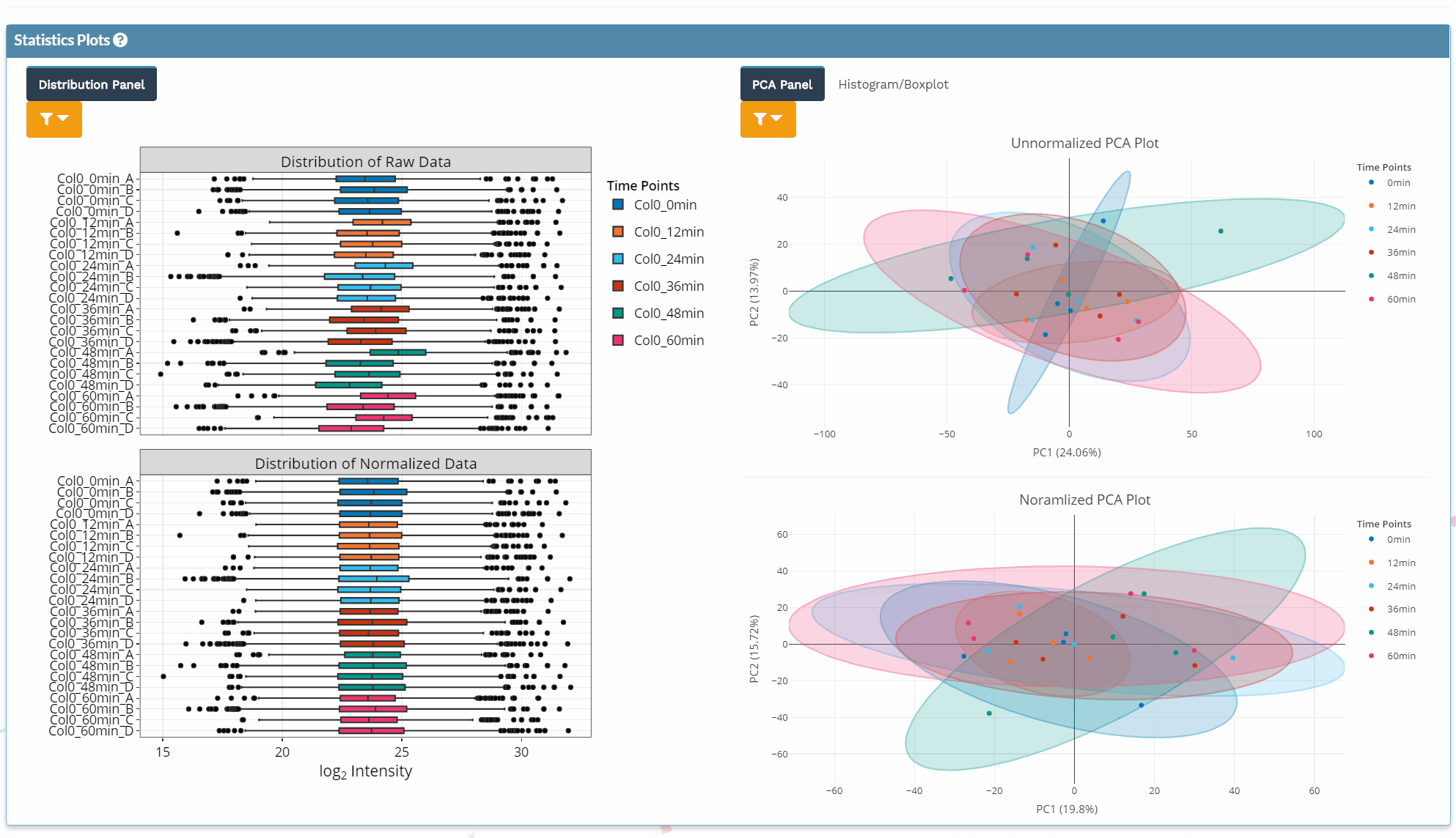
Section 1: Statistics Plots
- Different quality control plots, such as boxplots of the intensity distribution of each sample, principal component analysis (PCA) plots, and histograms allow for the evaluation of data quality of the filtered data before and after normalization.
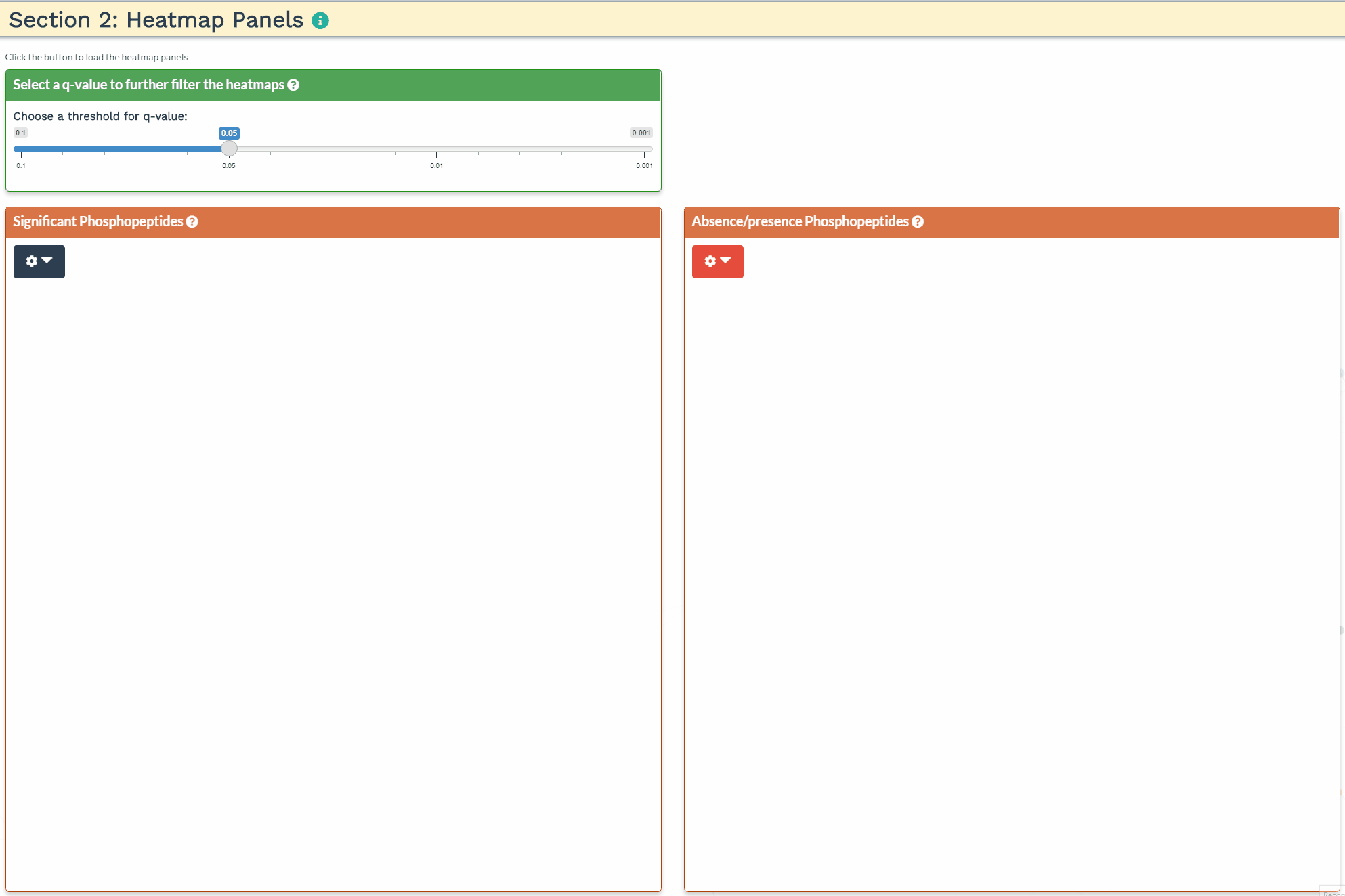
Section 2: Heatmap Panel
- To reveal peptide groups with similar intensity patterns over time, the significantly differential phosphorylated peptides and absent/present peptides can be explored through heatmaps of the hierarchically-clustered filtered data.
Section 3: Selective Peptide(s) Visualizations
- To plot the intensity values of a single peptide or a handful of peptides together, the protein ID can be searched within the search box for its visualization.